Lost Universe is often seen as the black sheep of Hajime Kanzaka’s works. While it’s set in the same pseudo-continuity as his more famous Slayers franchise, it never really reached the same level of popularity.
Actually, that’s a bit of a lie. The series gained a great degree of infamy over its “Yashigani” episode. That said, though, the rest of the show was pretty much left in the dustbin of time.
To be fair, the show didn’t have the same “oomph” as its fantasy-themed predecessor. The visual presentation was a bit less polished, with stiff animation and a lot of cheap CGI. At the same time, the narrative lacked the energy and narrative pull. The end result was a series that felt more like a pretender, than a full-fledged member of the Kanzaka-verse.
For those willing to look beyond the shortcomings, though, Lost Universe is a fun show that, while far from a masterpiece, does a decent job in delivering the laughs and the feels. The characters are charming, the setting is an intriguing blend of sci-fi and sorcery, and the plot is decently delivered.
The series was originally released in the west by ADV Films. After ADV closed up shop, Right Stuf acquired the series, which they released under their Nozomi Entertainment label in 2007.
In July 2014, Nozomi released the series in Litebox format. We were fortunate enough to receive a review screener for the show and, since we received the full product, I felt that it was only right that we do a full teardown.
(Click images for larger versions)
Packaging
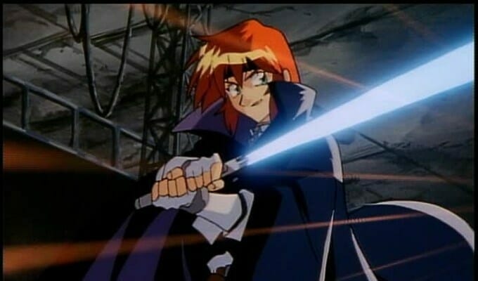
The set ships in a single Scanavo DVD case. The front cover features a piece of key art, which places the major cast members in front of a “deep space” background. Kain takes the front and center spot, as he poses with his Sword of Light, as he’s flanked by Canal to the upper-right and Millie to the lower-left. The show’s logo occupies the whitespace in the upper left corner of the case.
The back of the case features a two-pane design. The general appearance is modeled after the computer monitors on Kain’s Ship, with a green grid background, and gray “windows” containing the relevant information. The left half of the cover features a series of shots from the show, while, the right contains a synopsis, and a list of extra features.

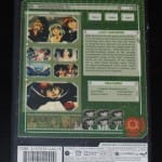
The bottom of the case contains the “feature grid” that’s a mainstay for Right Stuf’s releases, as well as the bar code.
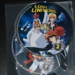
Inside the case, the discs are stored on a paged setup. Each of the discs contains a piece of key art from the show, set against a starry background. The show’s logo, disc number, and standard branding are arranged along the top 1/4 of each disc.


Menu Structure
Note: Since the release has a consistent look & feel across the discs, I will only be covering the first disc of each edition. Further dissections would be redundant.
The front menu is presented as a “splash” screen. The right side of the screen is occupied by a piece of key art, while the left contains the show’s logos, and the list of options. The options consist of white text contained in a green “computer matrix” styled box. The cursor is a yellow hexagon.
The episode menu is modeled after the computer monitors on Kain’s ship. The episodes are arranged in vertical “tabs” on the left portion of the menu, while the actual chapters occupy the right half. The “Part A” and “Part B” halves of the show are displayed as screenshots. The “Main Menu” option takes up a small square block in the bottom right corner of the screen.
Both the Languages and Bonus menus follow the same motif as the Episodes menu. However, these consist of a single-pane, with the options presented in the center of the screen. The “Main Menu” button occupies the same bottom-right position as it does in the Episodes menu.


Video Quality


Overall
Nozomi’s Lost Universe Litebox set is an attractive, clean release. The packaging design, while a bit on the generic side, is still eye-catching, with great use of color. The “computer screen” motif in the back of the box and the menus is charming and functional, with smart layouts and text that’s incredibly easy to read.
The visual quality does suffer, due to the show’s age and the generally low budget. Still, the technical presentation is strong, with no clear artifacting in the video or distortions in audio.